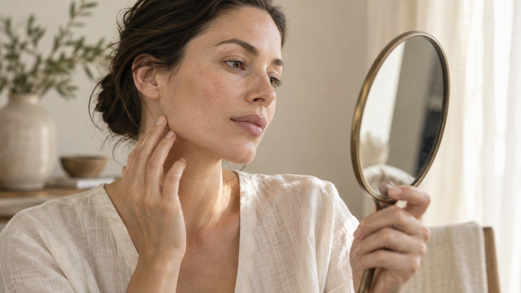
A pair of glasses can feel right in shape and wrong in color, or the other way around. That is a useful reminder that face shape and skin tone answer different styling questions. Shape describes proportions and contours; skin tone concerns visible color, with lighting and surrounding colors affecting what you see. You can consider both when choosing frames, hair color or clothing near the face, but neither lets you deduce the other. Start by separating the observations, then bring them together in a comparison you can actually see.
Separate the outline from the color within it
Face shape is usually described through the relationship among face length, forehead width, cheekbone width and the jaw contour. A rounded chin or a broad cheek area can contribute to the description. Skin tone refers to aspects of visible skin color, while undertone is a styling term used to describe an underlying color tendency. These are different kinds of observations. A long outline does not imply a warm color direction, and a cool-looking complexion does not imply an angular jaw.
Photographs can make the two questions look connected because the same lighting changes both. A shadow deepens the color along the jaw and can make the edge appear sharper. Bright light may wash out the skin and obscure the cheek boundary. If an automatic tool changes its shape label when the color balance changes, inspect its landmark placement rather than assuming the new label reveals a hidden connection.
For a practical decision, write two separate notes. One might say “cheeks are widest, with a soft taper toward the chin.” The other might say “I prefer the muted blue frame to the bright orange one in daylight.” Both statements are more specific than a combined face-shape-and-color type. They also leave room for personal taste, which is part of styling rather than an error in the analysis.
Measure proportions under consistent conditions
For the shape comparison, use a front view with the head level and a neutral expression. Move hair away from the forehead and cheeks without pulling the skin tight. Place the camera near face height, step back and crop the picture later if needed. A close selfie can exaggerate nearer features, while a tilted chin changes the apparent lower-face length. These setup differences can matter more than a small measurement difference.
Choose the landmarks before measuring. A common face-length comparison runs from the centre of the visible hairline to the bottom of the chin; cheek width uses matching points across the cheekbone region. Different tools may define those points differently. Compare flat distances within one photograph, rather than mixing a curved tape measurement with a projected photo width.
Repeat the measurements and keep uncertainty where an edge is unclear. A fringe, beard or low-contrast background can hide the outline. You may be able to describe the cheeks and jaw confidently while leaving the forehead width open. There is no need to force a single face-shape result before trying frames. Fit, scale and the visible contour give you enough to begin.
Use soft light that reveals both sides of the face. For measuring shape, a plain contrasting background helps you follow the edge. For comparing colors, keep the setting as neutral as practical so a strongly colored wall or lamp does not dominate the scene. One photograph can be a convenient reference, but a mirror comparison gives you another check on what the camera has changed.
Observe color without treating a photo as a verdict
Compare colors near your face in diffuse daylight when possible. Avoid mixing a warm indoor lamp with daylight from one side because the two halves can look different. Keep makeup, tinted products and the surrounding clothing consistent if you want to isolate the effect of a frame color. If you normally wear makeup, you can make a second comparison with your everyday routine rather than treating the bare-face test as the only valid one.
Choose two or three real options instead of trying to name your undertone first. Compare a softer shade with a more saturated one, or a warmer brown with a cooler grey in otherwise similar frames. Notice whether you prefer a pronounced contrast or a quieter transition. These are visual preferences you can assess directly; a label does not need to explain every difference you enjoy.
Phone cameras apply automatic exposure and white balance, so sequential photographs may shift even if the room looks unchanged to you. Place the options side by side when possible, keep the camera position stable and avoid filters. Use photographs as reminders of the comparison, with the mirror and the actual item as additional evidence.
A face shape color analysis tool may bundle several outputs together, but the shared upload does not make them equally reliable or interchangeable. Inspect what each result claims to measure. If a service gives a seasonal palette without explaining its color conditions, treat it as a suggestion to test. It cannot establish a dependable palette merely by finding the outline of your face.
Combine frame geometry and color one choice at a time
Begin with physical fit. The bridge should sit comfortably, the temples should not squeeze and the frame should remain stable when you move. Check whether the lower rims touch your cheeks when you smile. A color you love will not make an uncomfortable frame easier to wear, and a shape recommendation cannot compensate for a poor bridge fit.
Once fit is acceptable, compare geometry. An angular rim can contrast with curved cheeks; a rounded one can echo them. A deeper frame occupies more vertical space than a shallow design, and a strong upper edge draws attention across the eye area. These effects are options to test according to your preference, rather than corrections required by a particular face shape.
Then compare color within the same model if several versions are available. This controls the geometry so you can notice color more clearly. Dark, opaque rims often create a stronger visible boundary than pale or translucent ones, although thickness and finish also matter. A glossy black frame and a thin matte grey frame differ in more than hue, so avoid attributing the entire effect to skin tone.
| Question you are testing | Keep similar | Change deliberately |
|---|---|---|
| Do I like this frame outline? | Color, lighting and approximate size | Rim geometry or depth |
| Which color do I prefer? | Frame model, pose and light | Frame color |
| How much contrast do I want? | Comfortable fit and viewing distance | Rim darkness, opacity or visual weight |
| Will I wear it comfortably? | Ordinary movement and expression | Bridge, temple fit and frame dimensions |
Treat olive as a color description, with room for variation
Olive is used in styling to describe a greenish or muted cast that some people notice in their skin. It does not identify a face shape, and it does not by itself determine a seasonal palette. People described as olive can differ in depth, contrast and the colors they prefer near their faces. A single photograph under warm room light is a weak basis for assigning a more detailed category.
If you find the term useful, let it guide a comparison rather than close it. Try the actual brown, silver, green or red frames available to you and notice how each looks in consistent light. Color names cover wide ranges: one green can be pale and greyed, another deep and saturated. Rejecting an entire color family from a label can hide an option you would have liked.
The same approach helps with clothing. Hold two fabrics near the face under the same light, keeping their placement similar. Compare your preference for softness, contrast and overall effect. There is no need to interpret ordinary visible color variation as a diagnosis.
Keep a small record of what works in daily use
Save a few comparison pictures with a note about the lighting, frame model and color. Record practical findings too: comfortable bridge, no cheek contact when smiling, easy match with your usual clothes. Those details are reusable when you shop again. A bare label such as oval or warm may be much less helpful months later, especially if the original comparison conditions are forgotten.
Check a promising choice with your normal hairstyle and clothing before deciding. Hair framing can alter the visible proportions, while its color changes the contrast around the face. This is a reason to assess the whole appearance after testing the parts separately. It does not mean one feature determines all the others.
You may finish without a firm shape label or a named color season. That is an acceptable result when you know which frame fits, which outline you prefer and which colors you enjoy wearing. Use face shape and skin tone as two sources of observations, then let the actual object, your comfort and your taste carry the decision.